POP Flowers
Overview
For my first project in the Google UX Design Certificate, I was tasked to design a mobile app for a trendy florist.
POP Flowers is a trendy flower shop located in a metropolitan area. They want to expand their offerings to include custom arrangements created by the customer. They also sell unique bouquets and flowers for any occasion with a delivery service.
Role
Since this is a project I created, I am responsible for designing the app from conception to delivery.
Duration
December 2022 - March 2023
Identifying the opportunity
I conducted interviews and created empathy maps to understand the users I am designing for and their needs. A primary user group identified through research was educated, working adults between the ages of 25 to 50 who want a simpler way of ordering and delivering flowers because of their busy lifestyle and preference to save time rather than physically visiting the store.
The user group confirmed initial assumptions about customers of POP Flowers, but research also revealed that time was not the only factor. Other user problems included specific preferences on the flowers, personalized service, and an overall abundance of information overload that make it difficult to order flowers online or buy flowers in store.
User Persona
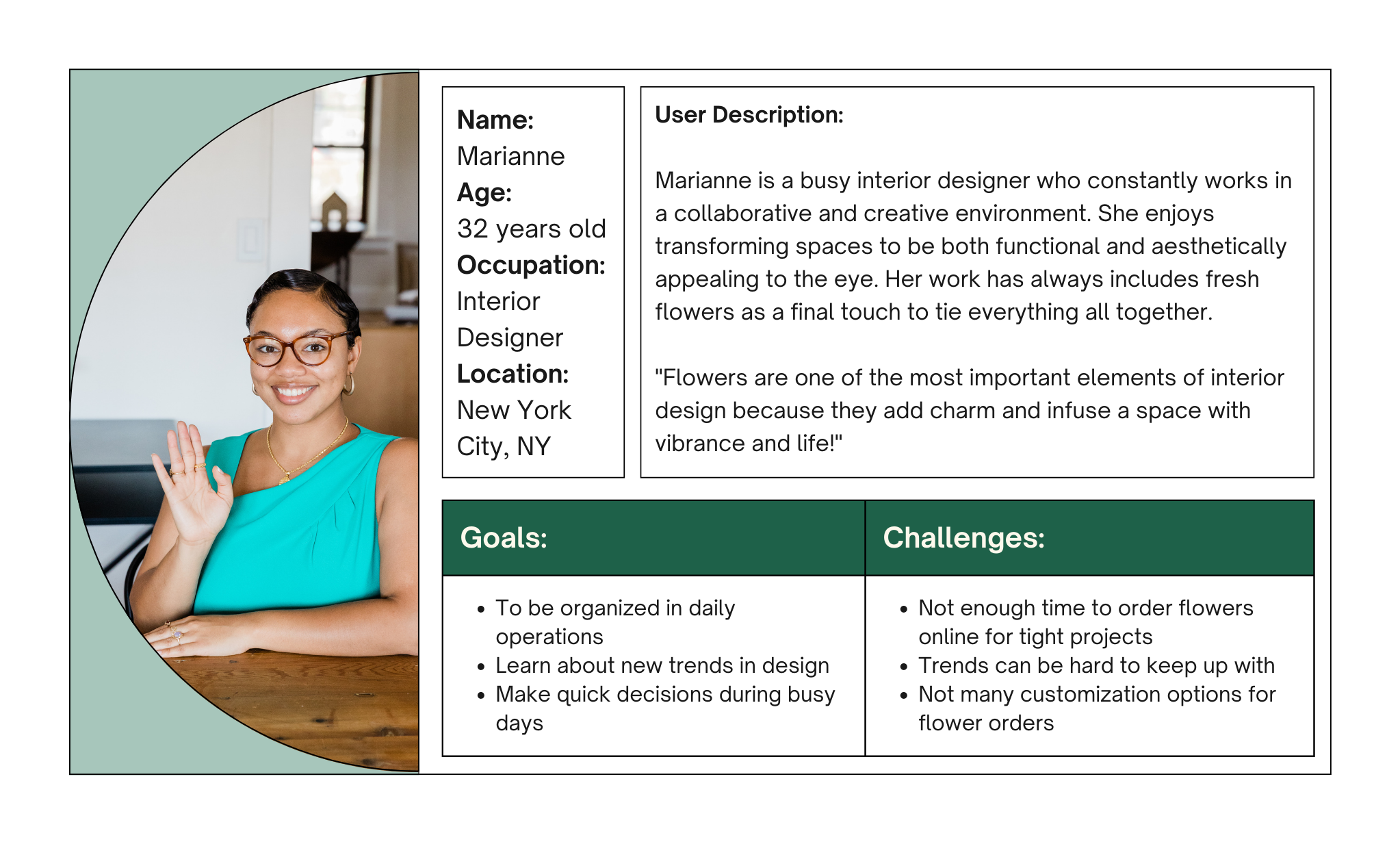
Problem Statement
Marianne is a busy, working adult who needs a way to customize flower arrangements and conveniently place orders because she can feel stressed and overwhelmed by various flower selections.
User Journey Map
I mapped out Marianne’s user flow to evaluate her experience when ordering flowers for her projects. The journey map revealed that a dedicated mobile app would provide the opportunity to create an easier ordering process, a simple checkout flow, and a delivery method.
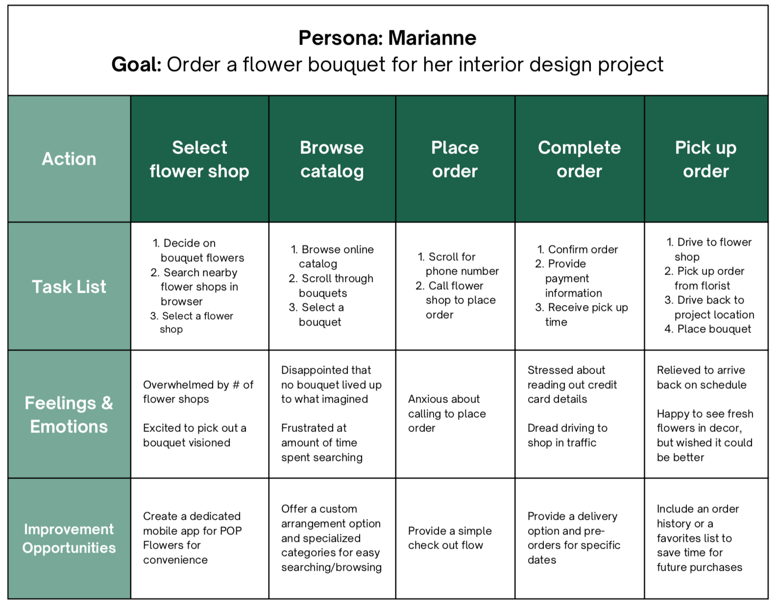
User journey map outlining the user flow of ordering flowers online
User Pain Points
1.
Limited Options
Users may find that the flower selection is limited or not varied enough to suit their preferences or the occasion for which they are ordering.
2.
Payment Options
Users may not feel comfortable with the security of the payment system or have limited payment options.
3.
Delivery Method
Customers may be dissatisfied with the delivery options available especially if they need the flowers by a specific time.
Paper Wireframes
I took the time to draft out the main screens of the user flow on paper to ensure that the elements included in the digital wireframes addressed the user’s pain points.
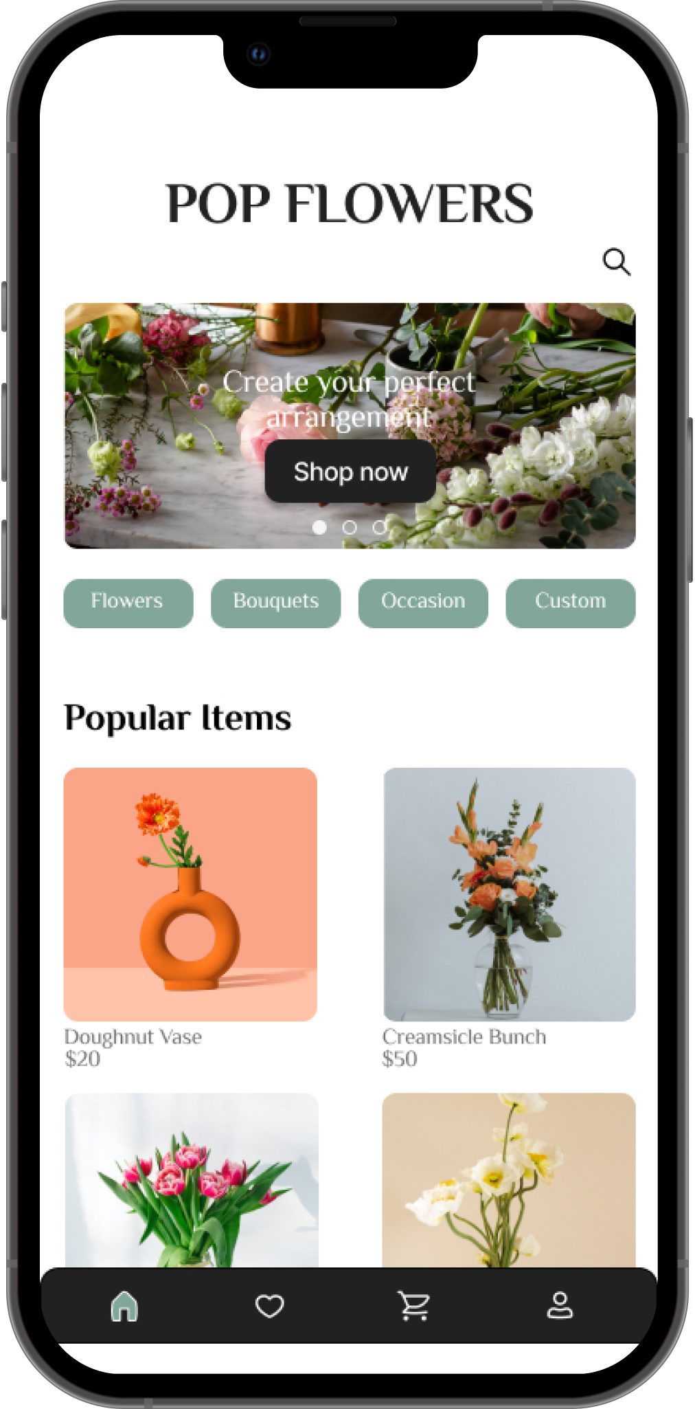
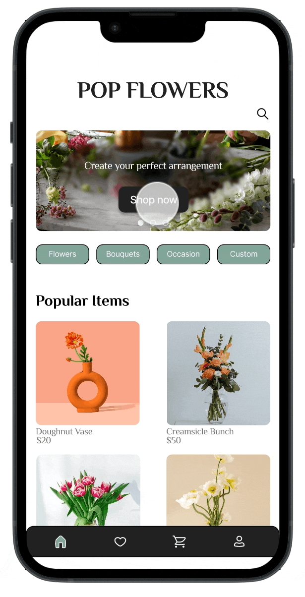
HOME SCREEN - I prioritized a quick browsing process by displaying the shopping categories to help users save time and easily begin their shopping.
CUSTOM ARRANGEMENT - I added a custom arrangement feature for users to build their own flower arrangements to ensure that they could get exactly what they wanted for their specific occasion.
DELIVERY - I added a delivery option to allow users to select a date and time for
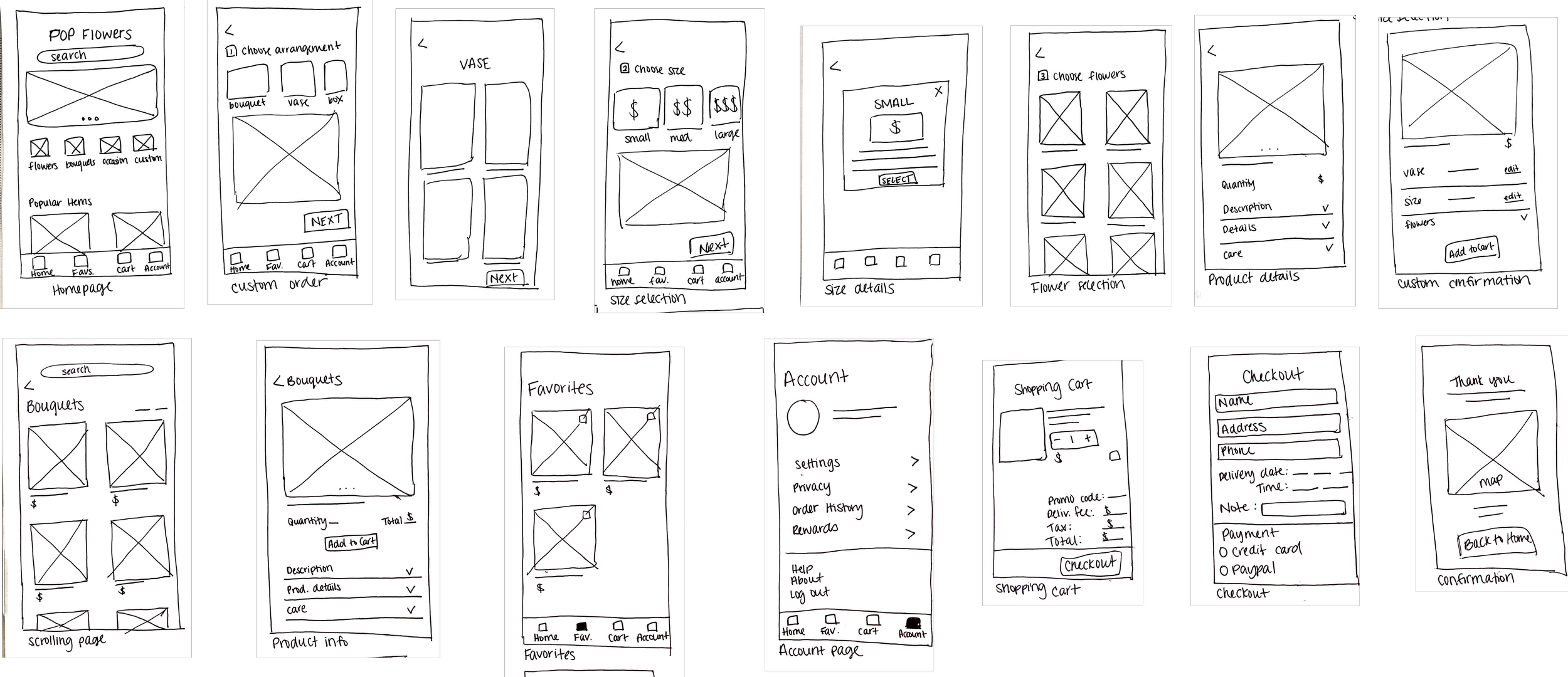
Wireframes of the key screens in the app
Digital Wireframes
As the initial design phase continued, I organized the digital wireframes to highlight the key user flows:
Ordering premade bouquets
Creating a custom arrangement
Checkout and confirmation process
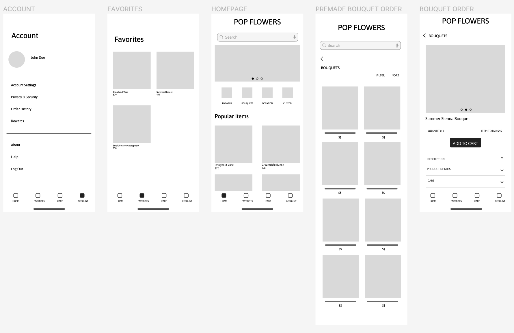
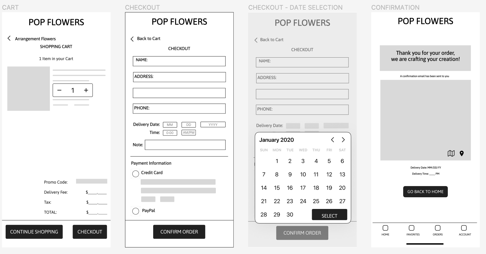
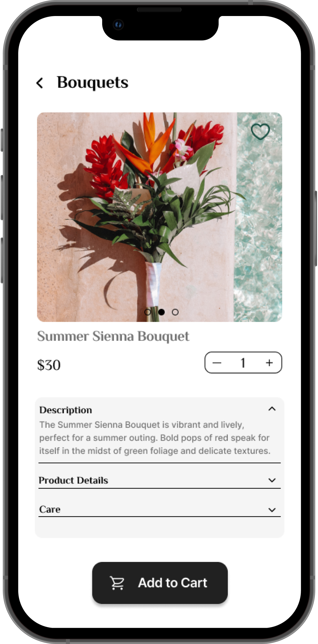
The key screens addressing the user needs
This button provides a convenient way to move back to the previous screen
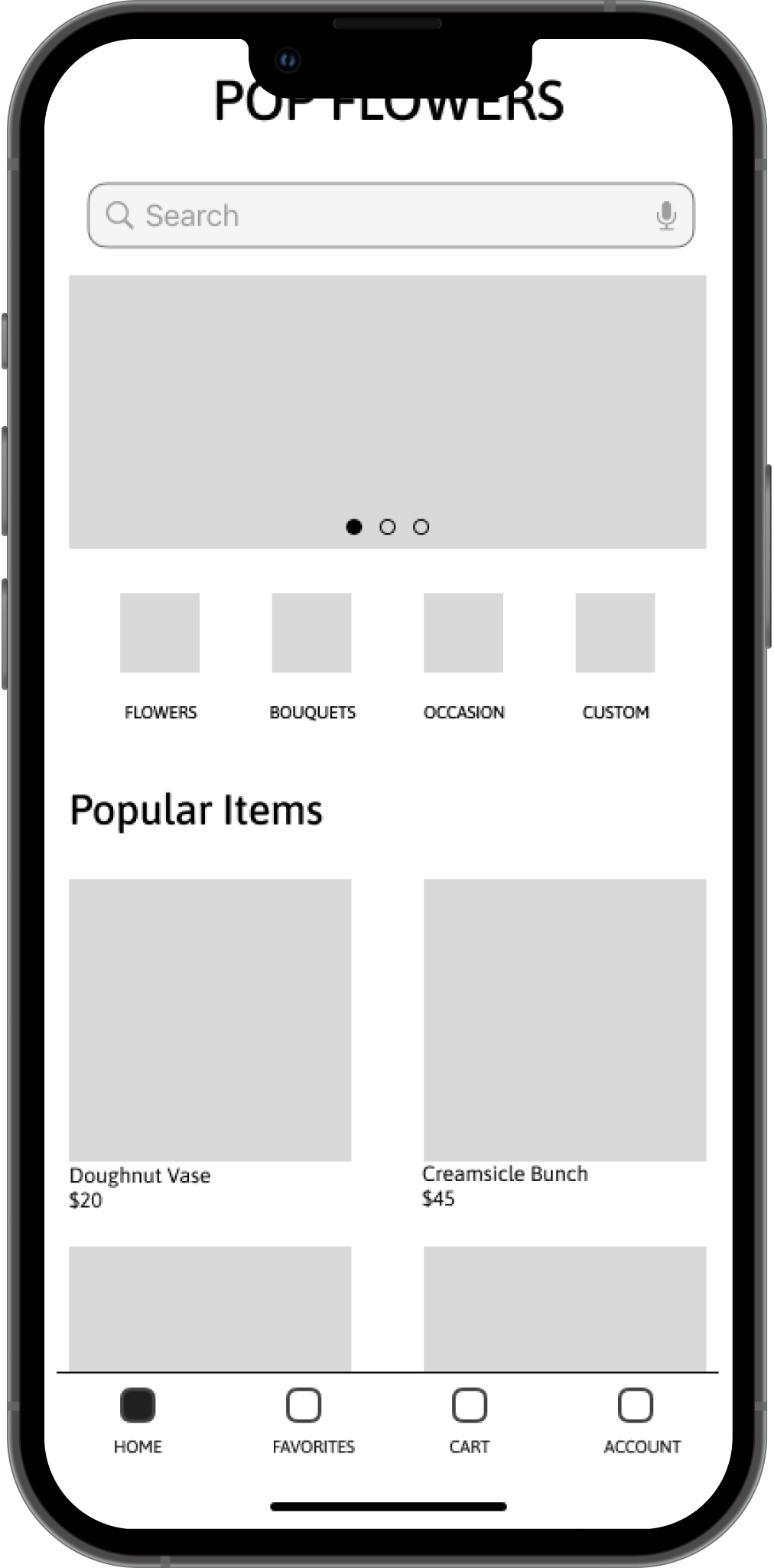
This button placement allows users to easily add items to their cart
Easy access to shopping categories that are screen reader friendly

Easy navigation was a key user need to address in the designs as well as including the app’s ability to work with assistive technology.
Solid indicator to assure users which screen they are currently viewing
“Favorites” tab to help users save products for future reference
Usability Study Findings
I conducted two rounds of usability studies. Findings from the first study helped guide the designs from wireframes to mockups. The second study used a high-fidelity prototype and revealed what aspects of the mockups needed refining.
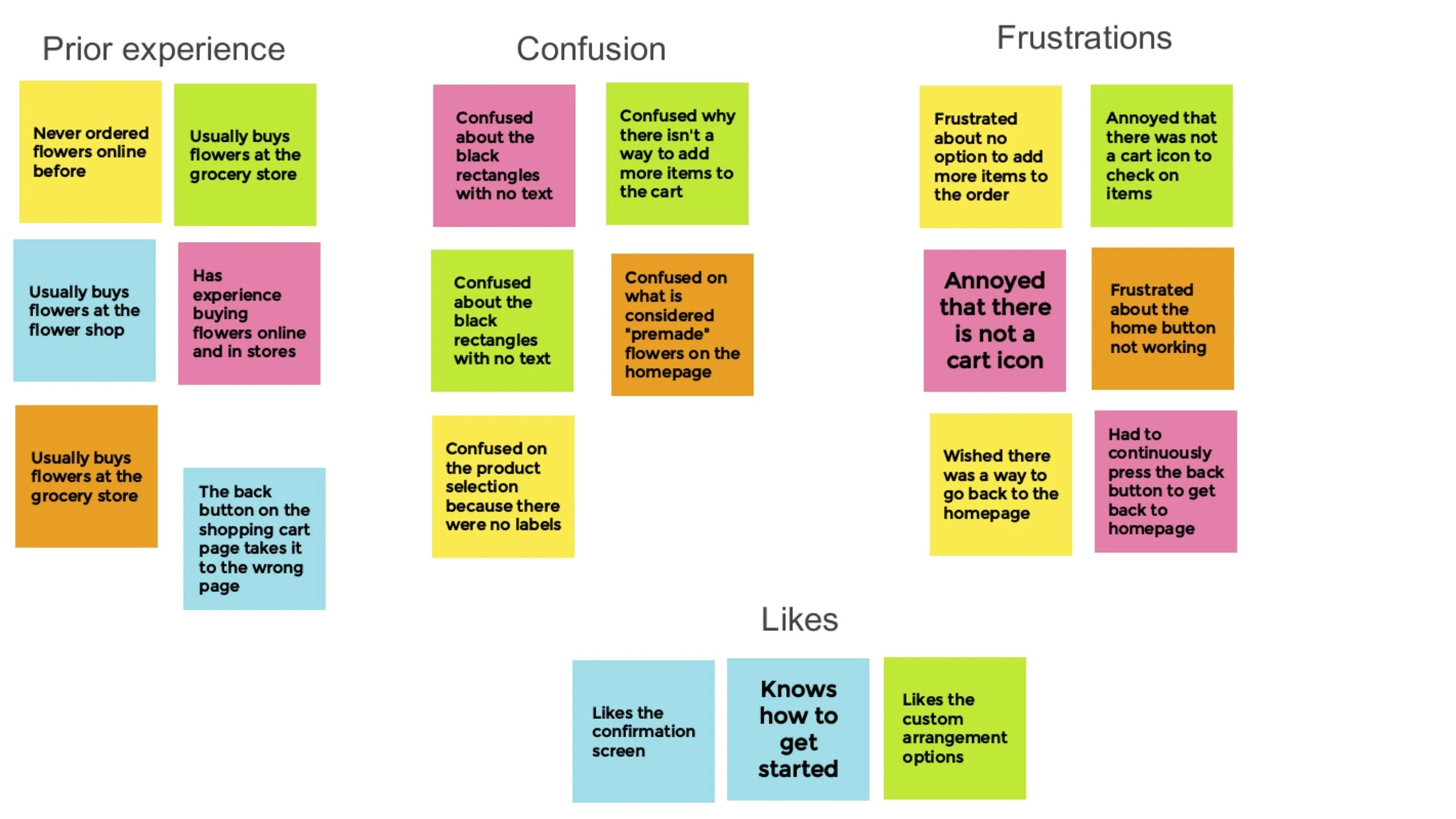
Card sorting after the first usability study
Usability Study # 1 Findings
Users want a better way to select the date for delivery
Users need a better cue for moving through the app
Usability Study # 2 Findings
Busy checkout page confused users when completing their order
Iterating the designs
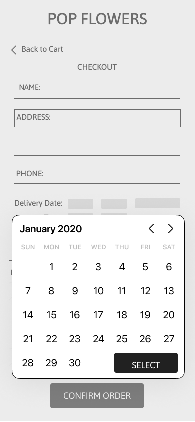
The first usability study revealed that the date selection was inconvenient for users during the checkout process because:
They couldn’t see which day of the week it landed on
Inputting the date manually took up more time
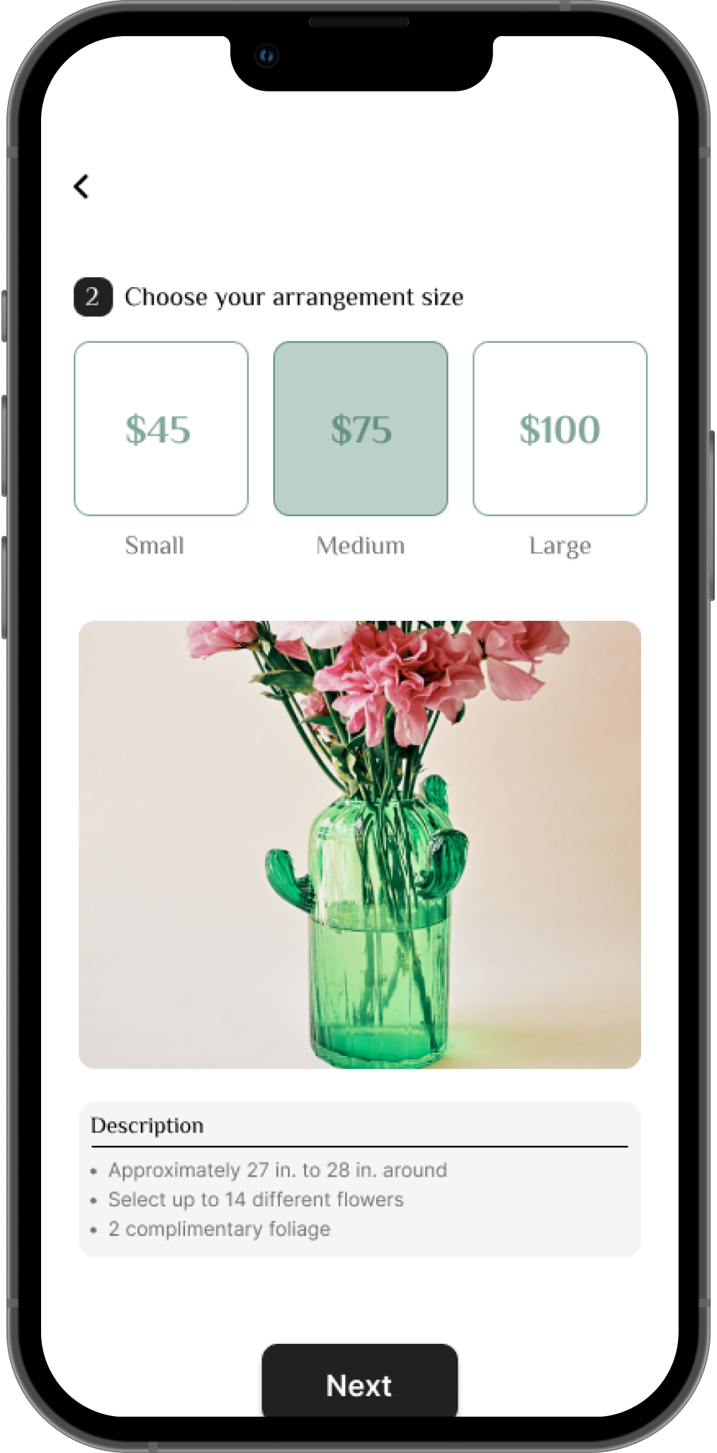
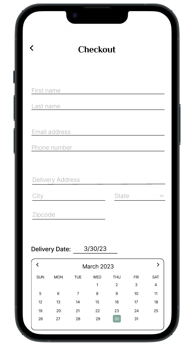
So, I changed the date picker to a calendar format to help users easily select a date in the future and allow them to view the day of the week of the numerical date.
Before the 1st usability study
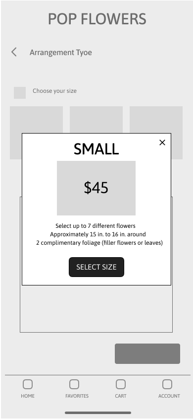
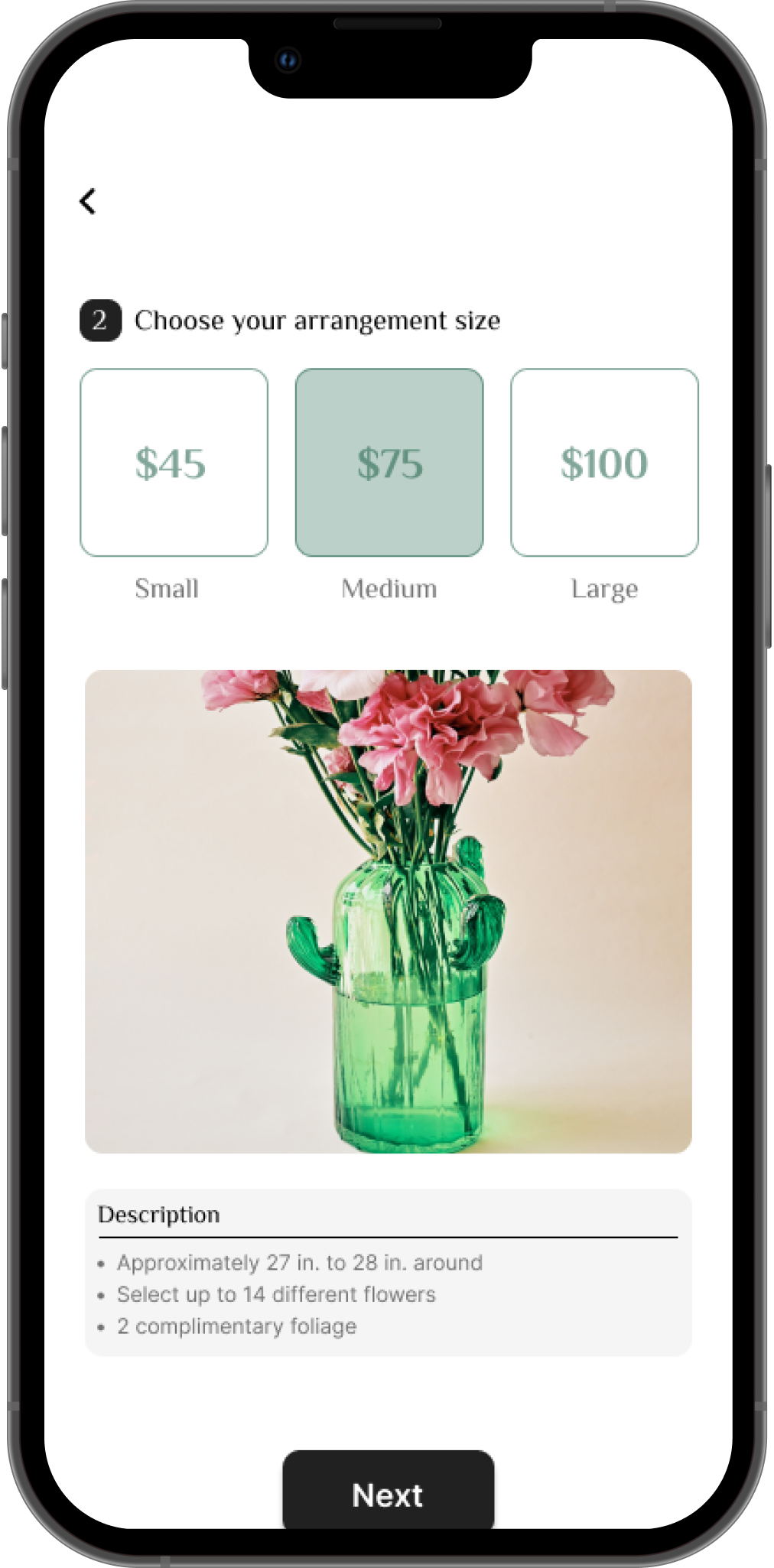
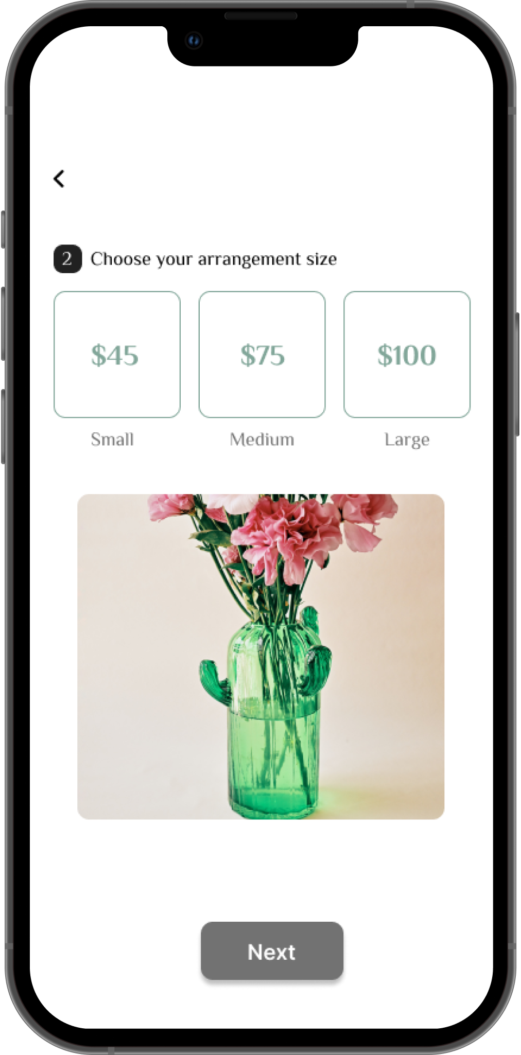
Early designs previewed a pop up selection for the user, but the usability studies revealed that users were tapping on the action buttons too many times. So, I made the screen more concise and direct by shading the selection to indicate to the user that their option has been selected and having the description automatically displayed- allowing for a cleaner user flow by reducing the amount of action required by the user to complete the task.
Before usability study
Before usability study
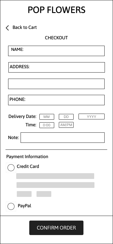
The second usability study revealed that the checkout screen was still busy with an unclear checkout process, so for better understanding and cleaner user flow, I organized the checkout process into 2 screens:
The customer information + delivery details
The payment information
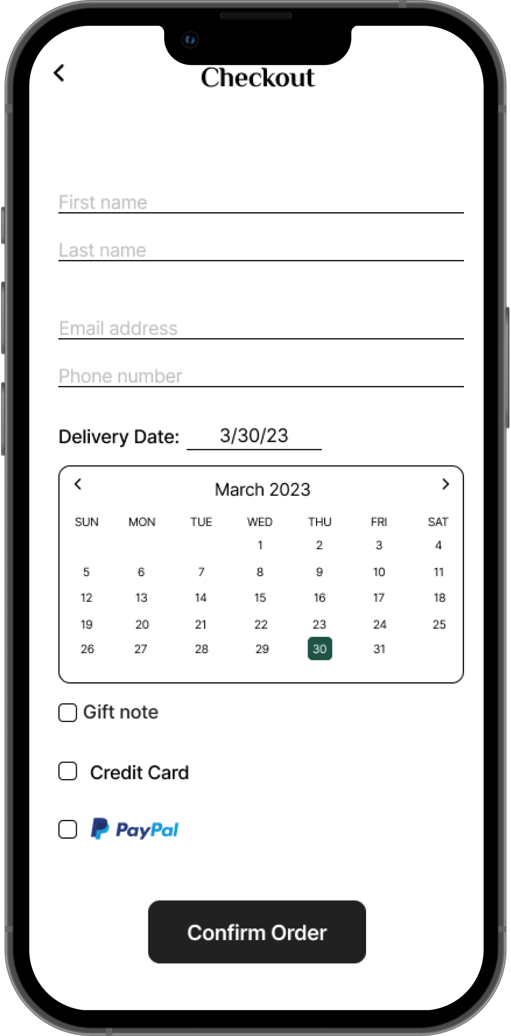
After usability study
After usability study
After the usability study
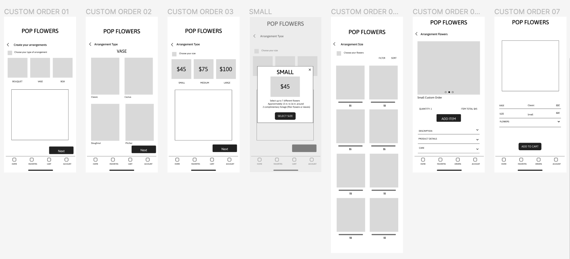
Ordering a Custom Arrangement
Accessibility Considerations
1.
Provided text alternatives for images to help users who are vision impaired access app content
2.
Used high-contrast colors to help make text easier to read for users with low vision
3.
Used icons to help make navigation easier to understand and use
Next Steps
Usability Study
Conduct an additional round of usability studies to confirm whether pain points encountered by users have been adequately resolved
User Research
Perform additional research to identify any emerging areas of of needs from users and the florist of POP Flowers.