Sol Tea M
Overview
Sol Tea M is a local bubble tea shop that recently opened in the area. They offer quality and freshly made tea with a variety of flavors to choose from.
The goal of this project is to organize their menu selection to reduce confusion and create a clear layout and structure to strengthen their brand identity.
Role
UX Designer - User research, design, and testing
Duration
June 2023 - July 2023
Hey, let’s check out this new bubble tea spot…
Identifying the opportunity
One day my friend and I were out in town, and noticed that there was a new bubble tea spot. We wondered if it was any good, so we always do what we always do before going to a new spot…check their website. The pictures of the drinks looked enticing, so we continued to look through the menu page, which was confusing because there was no clear cue to click on the drink names (we eventually figured it out that it expanded).
After moments of exploring the menu, we decided to give this place a try. The store ambiance was modern and tropical. I got a strawberry matcha with honey boba, and it was so good! The cups were great quality and the drinks were well made. We left hoping this place stays for a long time, so I wondered:
How can their website be more inviting and engaging for users?
How can they reflect their store ambiance on their website?
Understanding the users
After exploring the website myself, I wanted to gather information from others. So, I conducted an online survey that I sent out to 5 participants, who are bubble tea consumers, to understand their thought process when viewing Sol Tea M’s website and identify any user pain points.
“I see the main promotion on the website, but nothing else on the landing page. It makes me kind of confused where to go.”
“The drinks and photos makes me want to go into the shop. Having to scroll to see each drink does not make sense though.”
After the user interviews, I organized their responses through card sorting to identify common themes and pain points of users.

User interviews revealed that the main reason users visit the bubble tea shop is to browse the menu for specialty drinks and prices. Other reasons include viewing current promotions, learning about the company, and looking through pictures of their offerings.
User pain points
1. Difficult navigation
Users find it challenging to navigate through the website especially with unclear menu structures that guide them to the desired information.
2. Limited interaction
Landing page has very little user interaction which can diverge their interests
3. Lost connection
Due to lack of brand identity, users feel that pages are disorganized and do not feel connected to the company
Competitive Analysis
Who are Sol Tea M’s competitors in the area and what do their websites look like?
After hearing what participants had to say about their experience at Sol Tea M and bubble tea shops in general, I researched some of their competitors in the area to get a better understanding of what they are doing and how Sol Tea M can improve and generate more customers.
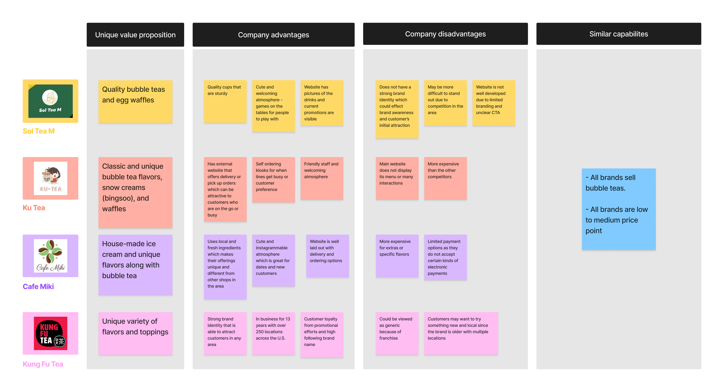
Competitive analysis of bubble tea shops in the area
Out of all the competitors, Kung Fu Tea’s website is the most developed in terms of having a strong brand identity that is clear throughout the site, and there are clear call to action that improve the users interactions and encourage them to explore the menu and other offerings of the company. So moving forward, I wanted to keep those elements in mind when redesigning Sol Tea M’s website.
Stirring up some ideas
Earlier, the user interviews conducted with 5 users on the existing landing, menu, and about pages, I found the following key pain points:
80% of users found that viewing the menu items were confusing due to the lack of visual hierarchy
60% of users were frustrated with viewing one menu item at a time and having to scroll through each picture
40% of users were confused on where to go or begin from the landing page
40% of users felt that the website was disorganized and lacked unity
Promotion is clear but current promotion is not noticeable
CTA is ambiguous to users because it does not specify exactly what “Explore” is
Users were frustrated with viewing the menu items one at a time

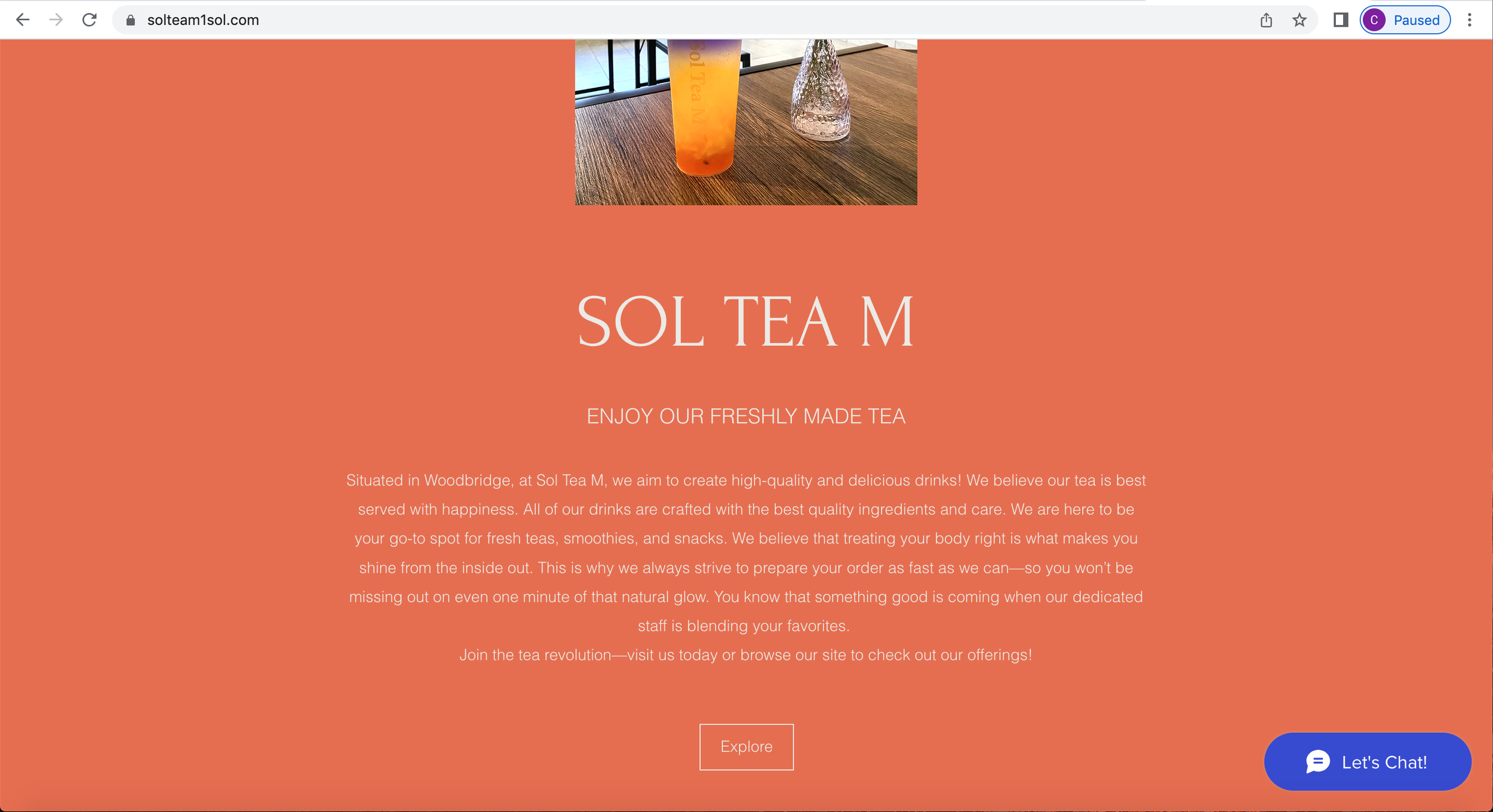
Sol Tea M’s landing page
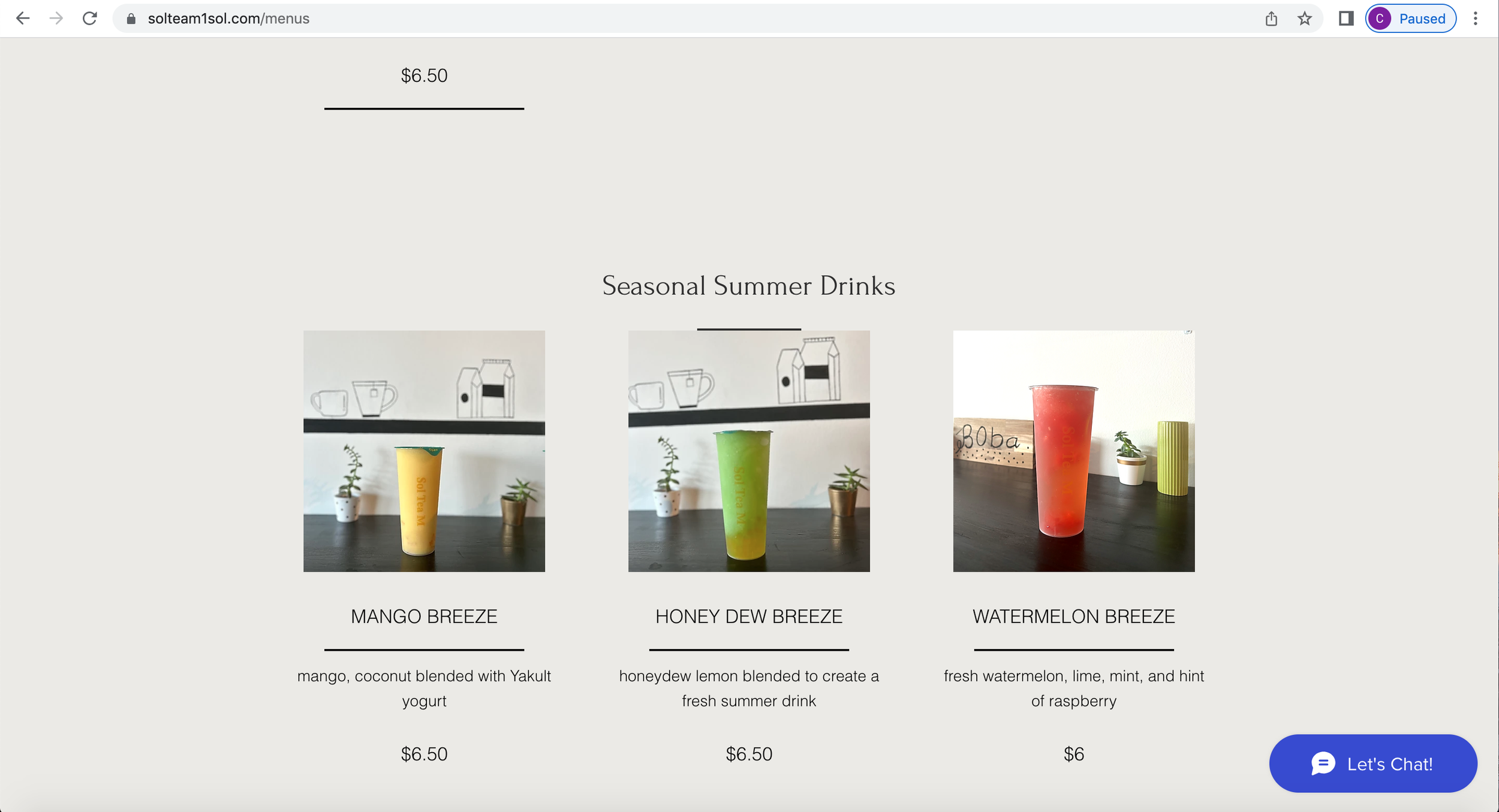
Sol Tea M’s about page
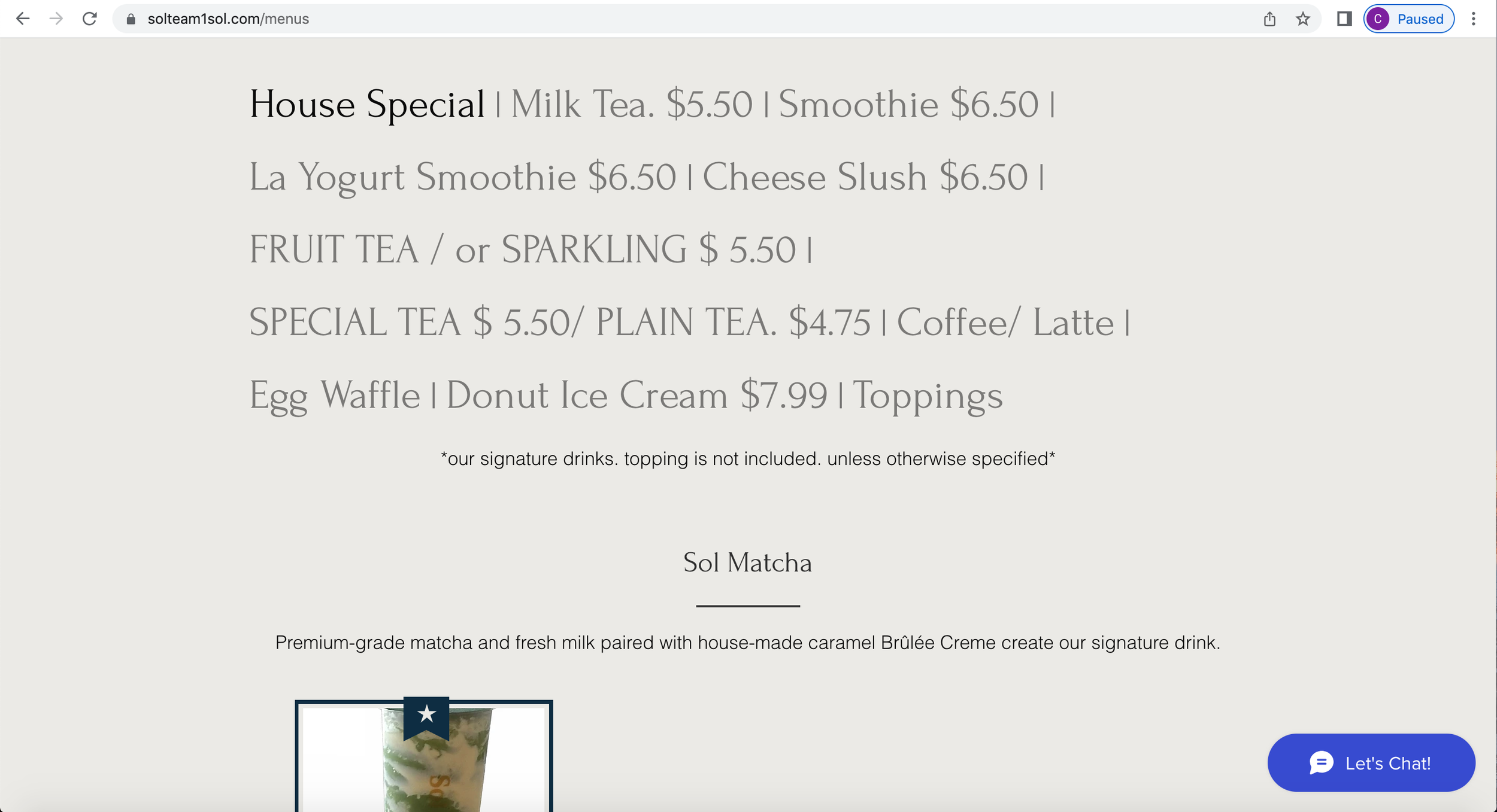
Sol Tea M’s menu page
Company name is not very visible - no clear brand identity
Brand logo is very visible though
Colors throughout the webpage are random - does not follow their brand colors (teal and yellow)
Text is hard to read in contrast with the background color
The menu names are clickable and expand the menu options
Earlier, user research revealed that this was confusing and unclear for users to click on to view the menu items
Now lets make tea
Wireframing the solution
Based on the pain points identified above, I focused on addressing these issues by developing some possible solutions:
Highlighting the current promotions and main CTAs to be more noticable
Creating a clear visual hierarchy and standardized UI patterns to improve brand identity
Reducing the number of steps to view the menu items
Then, I started to build wireframes that would later be used in the usability testing to gather feedback on the overall layout and structure of the prioritized webpages. The main elements that I focused on were establishing a visual hierarchy and clear structure for the overall design.
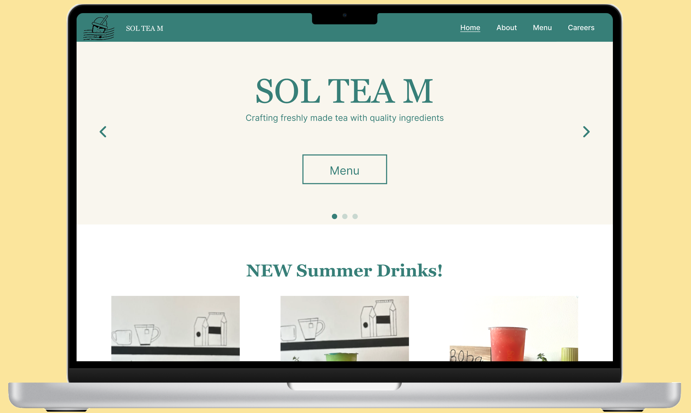
I made a sliding banner to have a clear CTA directing users to explore the menu to reduce confusion
The other 2 slides will show the loyalty card and promotion to help inform users about current deals
Main categories are displayed at the top for easy browsing
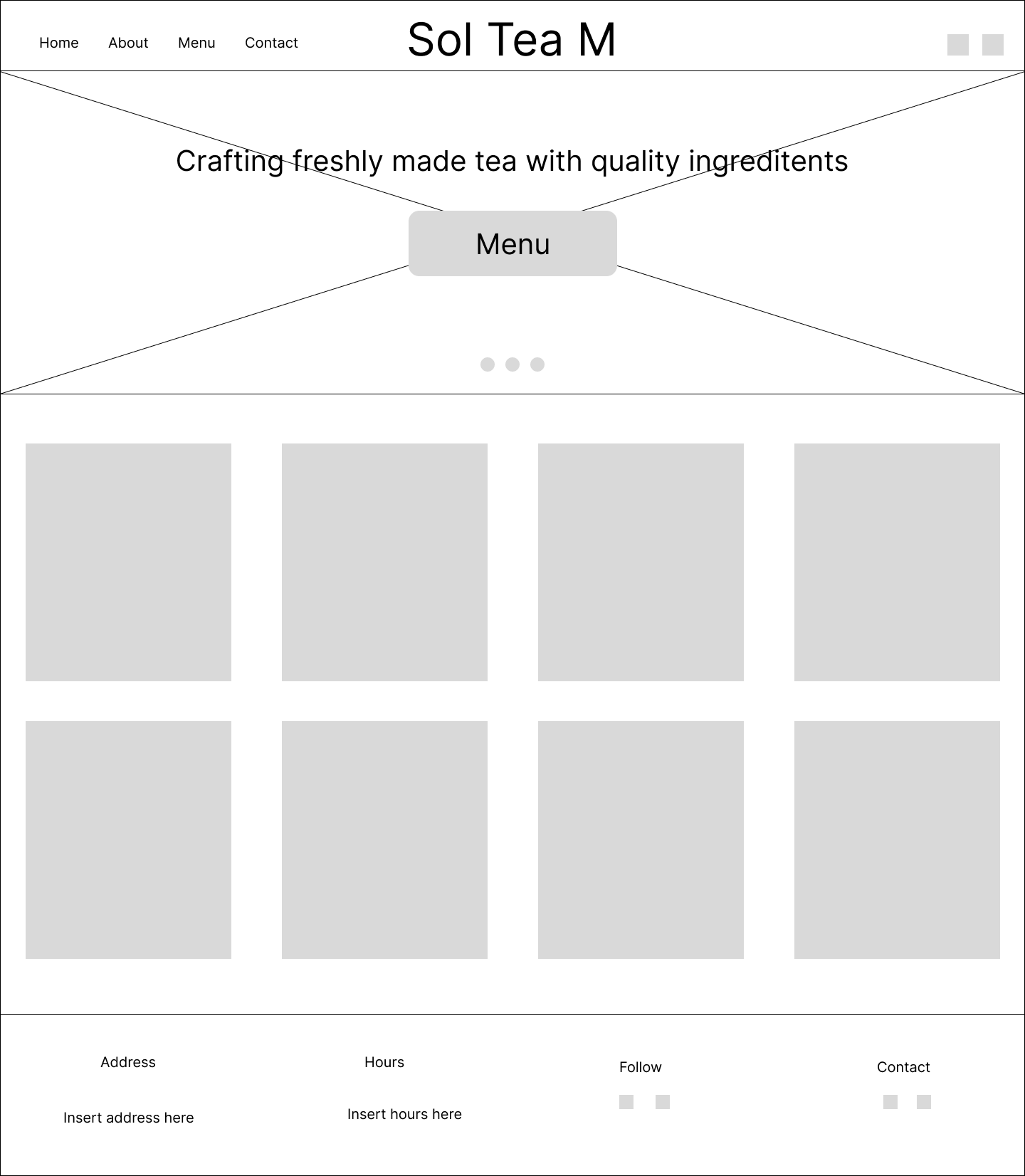
Landing page
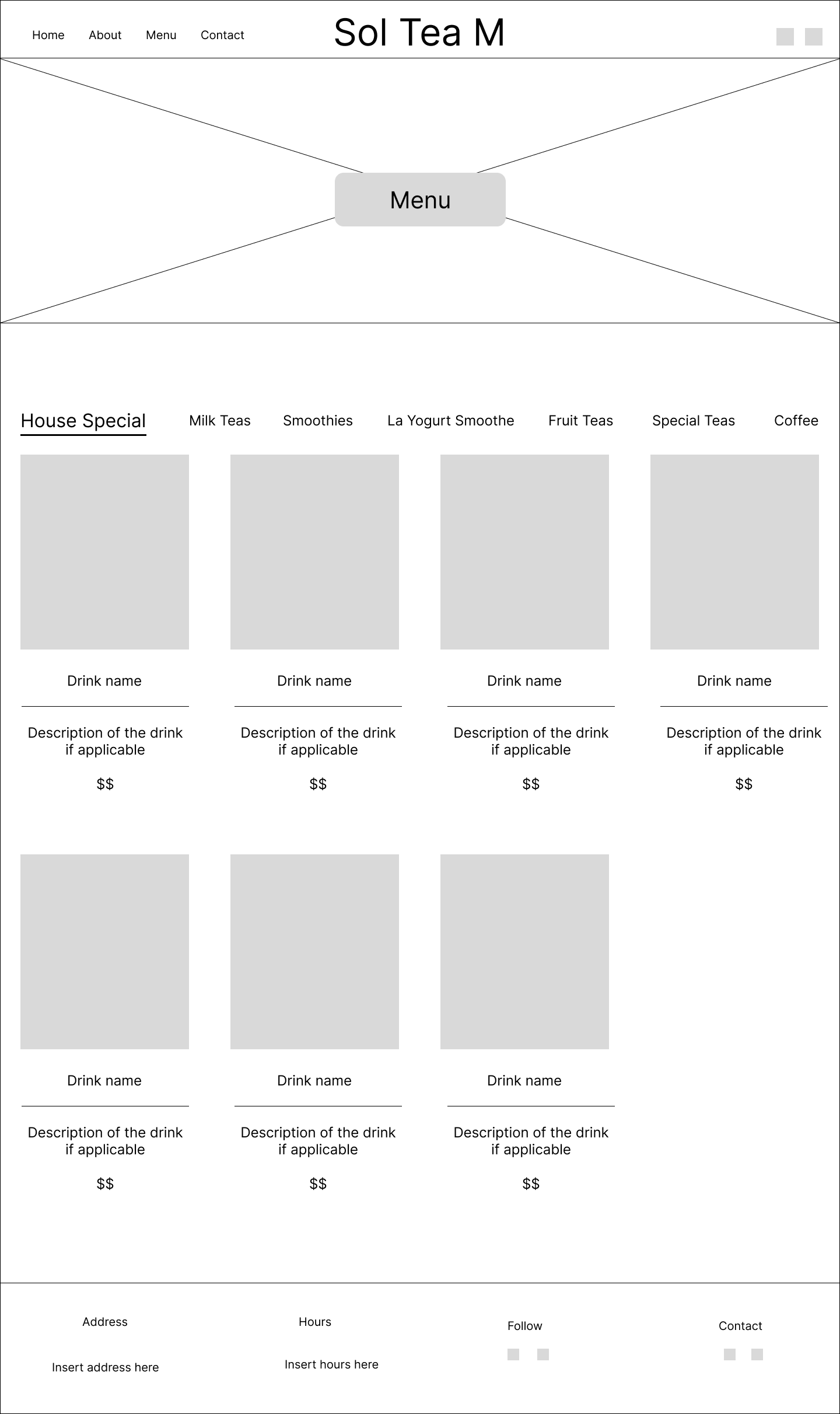
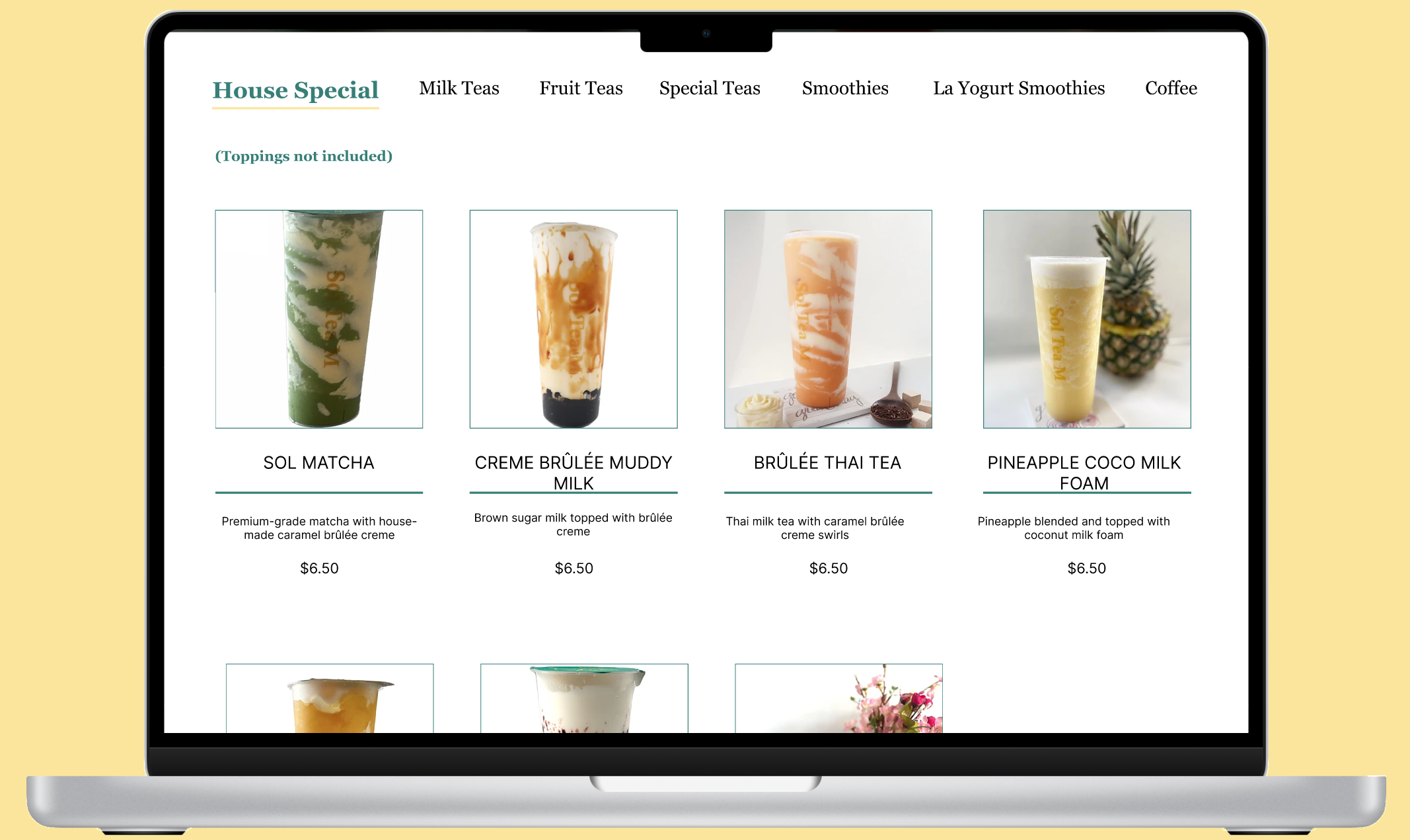
Menu page
Placed the menu button so that users can conveniently visit the product information
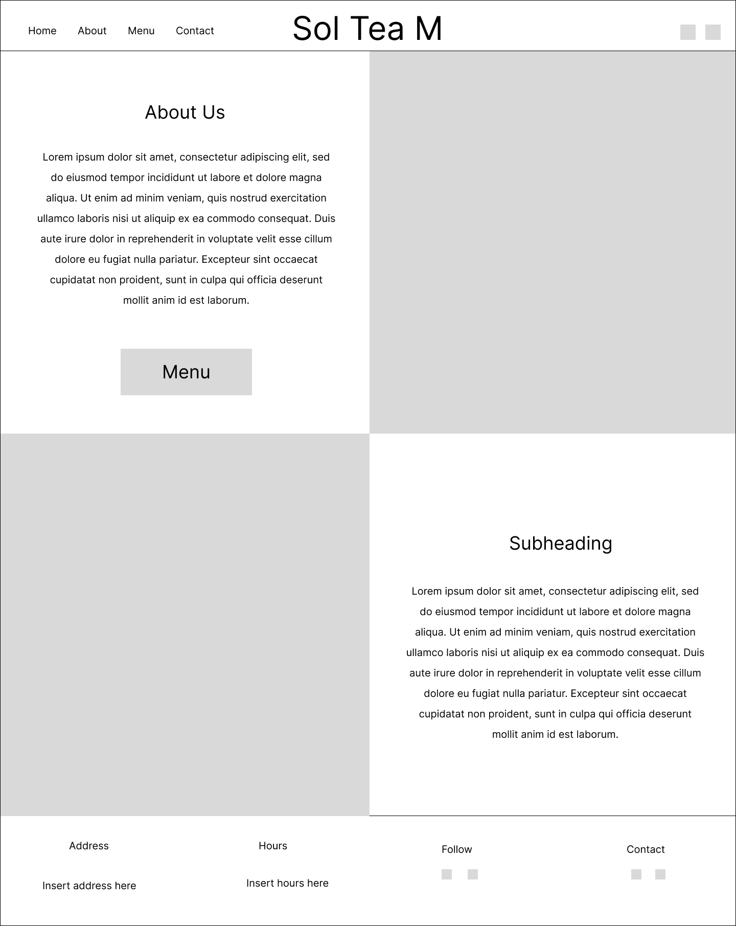
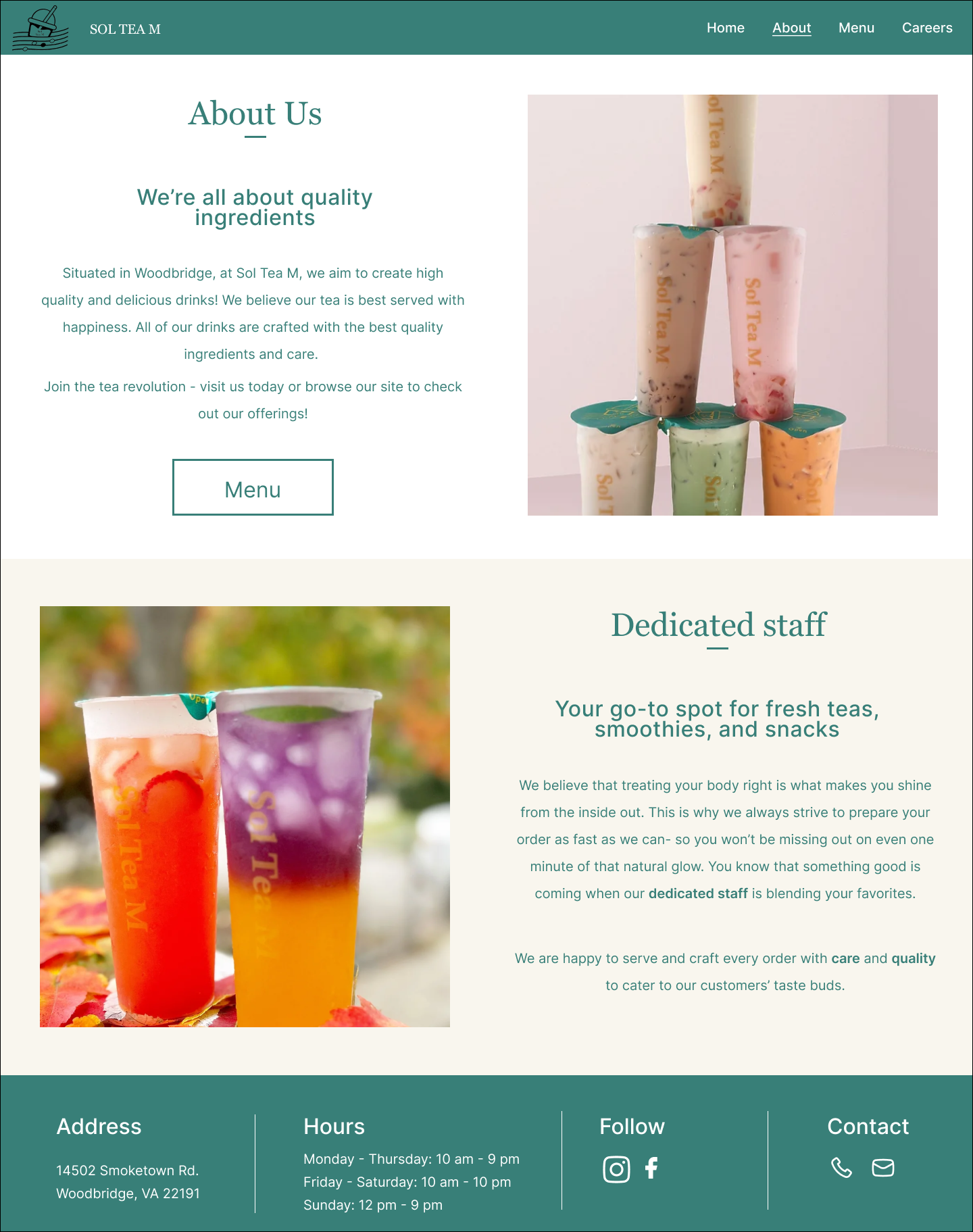
About page
Photo gallery of the drinks because users look for pictures when they visit the site to see if it is worth visiting
I added pictures of the drinks displaying their descriptions and prices to inform users about product information
Pictures are displayed in rows of four so that users can easily view the items
Split up the information into two sections with pictures for an easier read
Usability Testing
I conducted a round of usability testing with the 5 participants from the user interviews to gather feedback on the three pages and the structure of the designs. Users had an easier time navigating through the website and were able to quickly locate and browse through the menu items. However, the landing page still lacked user interaction and users wanted to know more about specialty drinks.
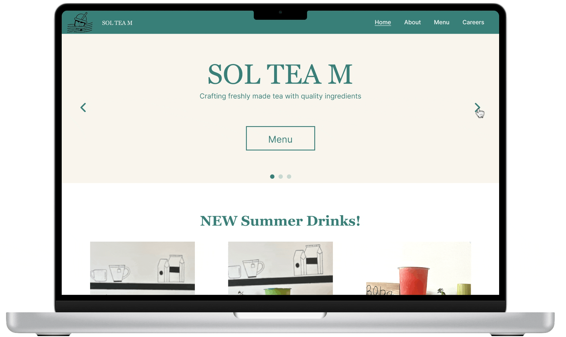
Looking back at the original website of Sol Tea M, they actually had seasonal summer drinks on their menu, but it was located at the very bottom of the menu which made it difficult for users to acknowledge.
Final design iterations
The usability testing revealed that users would like to see information about specialty drinks on the landing page because it was not visible in the previous design. So, I decided to iterate the landing page to improve the store’s product recognition and helps users locate new specialty drinks on the website.
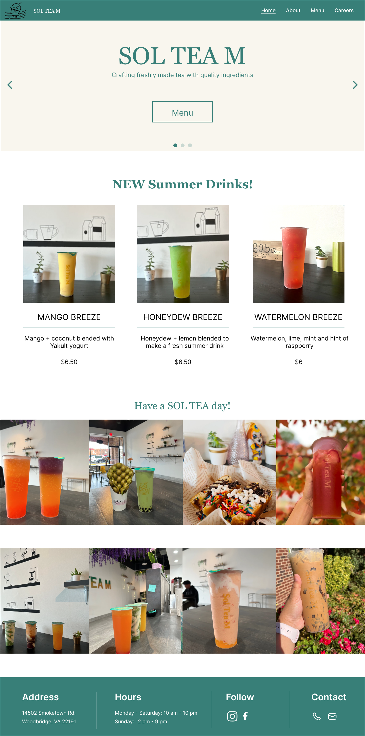
Added in the new drinks of the season to inform users - less scrolling and easier viewing
Photo gallery still remains to showcase customers’ drinks
Users were frustrated with viewing the menu items one at a time and having to scroll through each picture, so I rearranged the menu items for easier viewing for the users. Originally, there was a lack of visual hierarchy for the menu categories which made it confusing and difficult for users to interact with the viewing the products. So I aligned the menu categories at the top of the page for a better cue for users to interact with.
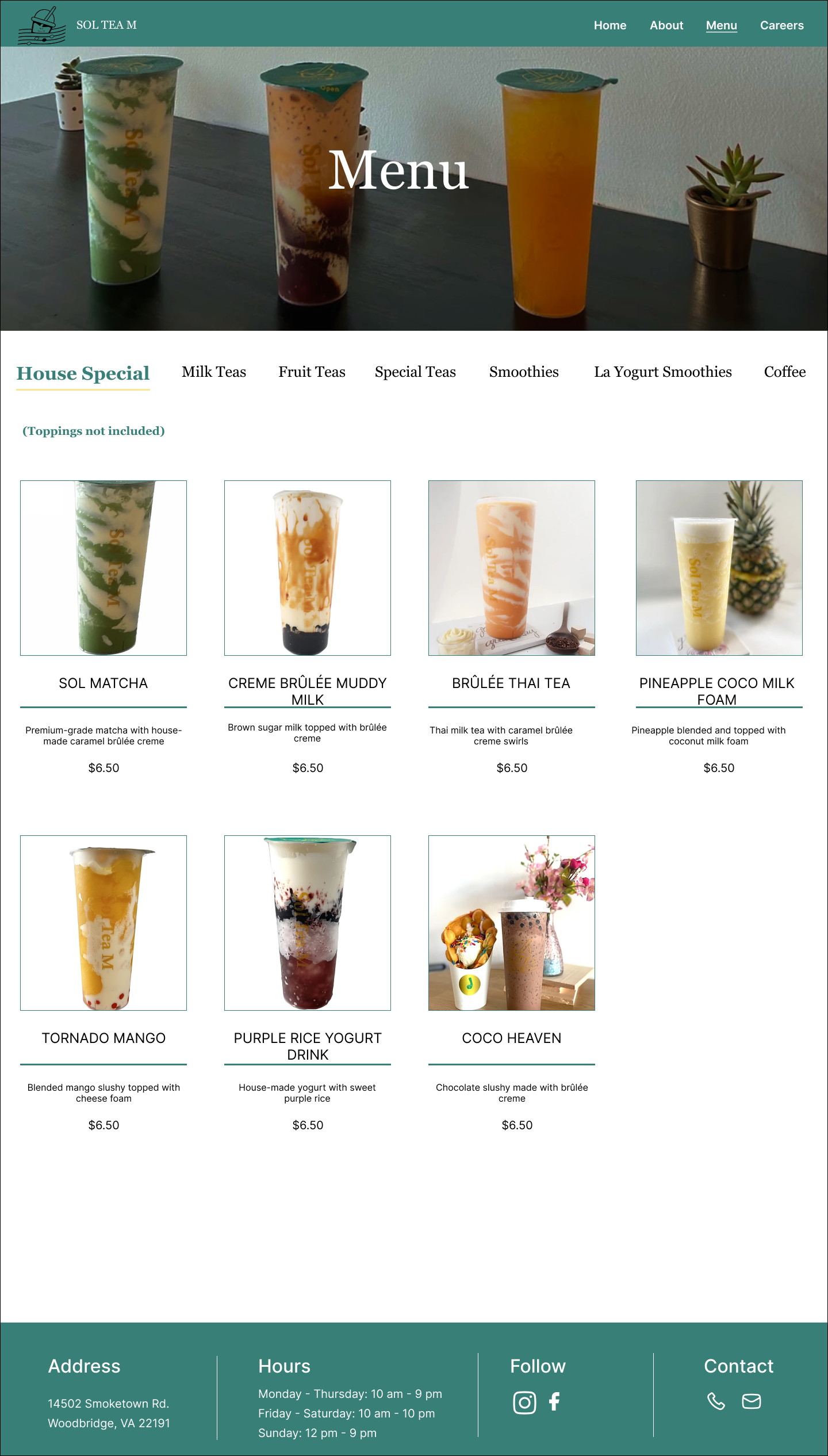
Labeled the menu categories at the top with visual hierarchy to help users understand which page they are viewing
Images and descriptions to help users identify products and aid in their viewing experience
Lastly, users felt there were inconsistencies and disorganization throughout the website due to a lack of brand identity which altered their connection and engagement with the company. Thus, I created a consistent theme and clear structure by using their brand colors like teal, white, and beige to capture the store ambiance.
Included the Menu button to help users quickly navigate to explore the menu
Color choices reflect Sol Tea M’s brand colors as seen on the lids and in their store
Next Steps & Takeaways
Next Steps:
Analytics: To further examine the usability of the website and success of the redesign, it would be important to analyze the website metrics and These data points can help identify areas of success and opportunities for iterations.
User feedback & iterations: After analyzing the metrics, user testing can help with identifying additional pain points to direct the future design iterations
Takeaways:
Importance of consistency: Users had an easier time identifying the store and navigating through the website because the structure and elements were consistent throughout the pages and created a unique identity for the store.
Continual iteration: UX design is an iterative process, so there is always room for improvement when monitoring user feedback and data analytics to identify areas that can be further refined to improve the user experience.